
.webp)
Every network proposal promises savings.
Consultants and carriers compare discounts. Employers compare projected costs. The problem is that these reports roll up statistics into one metric and often fail to answer the question executives actually care about: What will this network actually cost for our population?
Today, price transparency data makes it possible to answer that question using actual negotiated rates rather than summary benchmarks alone.
With negotiated rates that are now published and claims data that describes how a real population uses care, we can clearly answer what a workforce’s care will likely cost under each option.
Let’s take a look at this analysis that assesses an employer’s options for a sample Chicago population:
- 11,401 covered lives
- 59,095 claims
- Four networks: Blue Card, UnitedHealthcare, Cigna, and Aetna
What we found were four perspectives that a rolled-up report doesn’t surface. Any one of them, missed, could have steered this employer to a second-best network costing 3–10% more per year.
How Expensive Is Each Network, Really?
While the discount rate is the number most brokers reach for first, actual utilization from claims offers a more honest yardstick. Comparing each network’s negotiated rates to Medicare puts every network against the same benchmark, with no carrier’s billed-charge math in the way.
For the Chicago population, that yardstick produces the first finding.

At first glance, it seems like UHC / Optum is the winner. However, the differences in overall % of Medicare wrap are minute while the inpatient and outpatient care are quite sizable.
This is why the analysis doesn’t stop with the lowest overall rate. We need to know where they’re lower and whether those savings translate into lower total employer spend. The data shows this gap concentrates in inpatient and outpatient hospital care, which is where a real population’s spending concentrates too. This spread stays invisible in the discount conversation.
Those percentages are only the first step. The real answer depends on what each network costs in dollars and who ultimately captures the savings—the employer or its members.
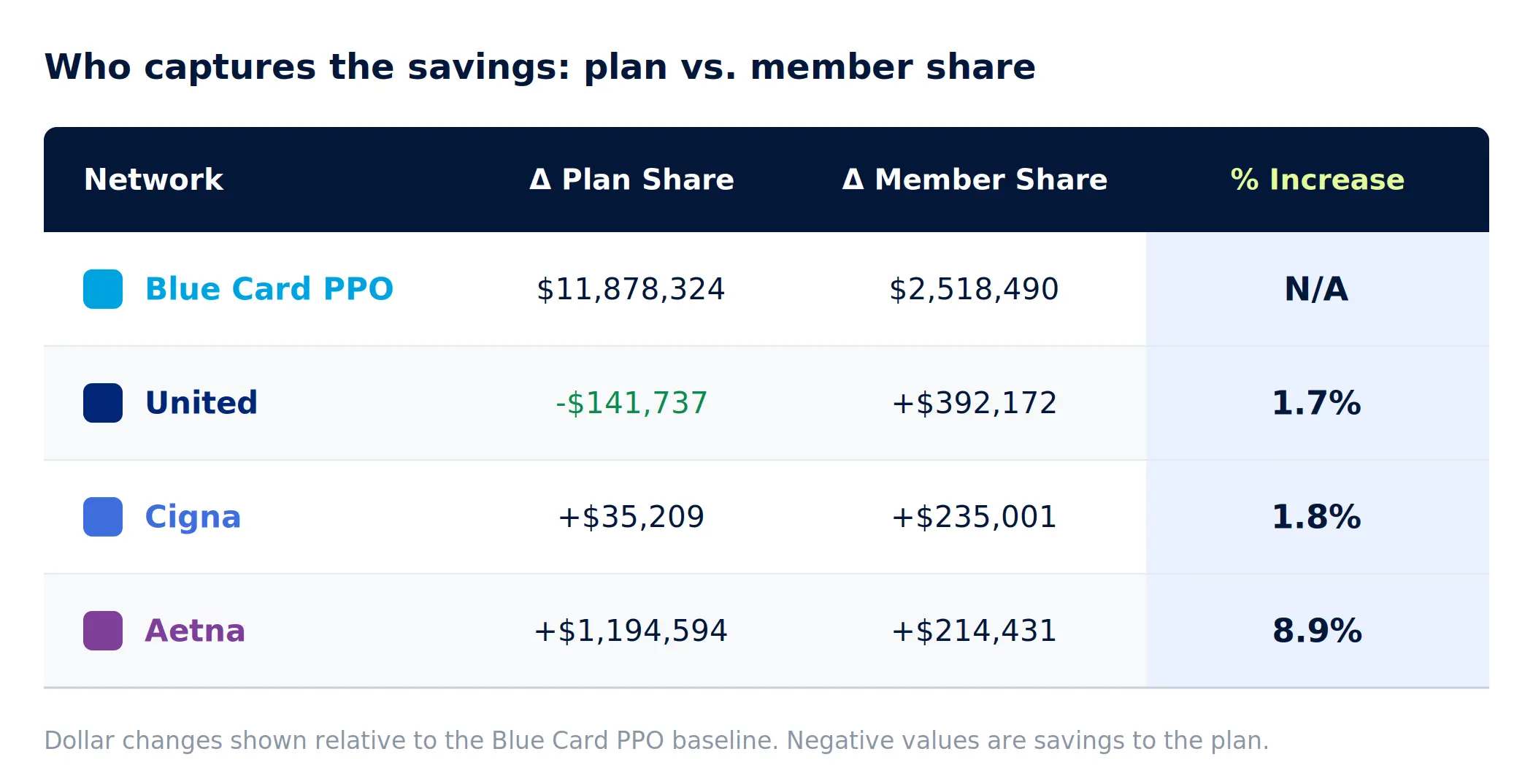
BCBS also comes out 2-9% cheaper here than the field, but the more useful finding sits in United’s row. United costs $250,435 more than BCBS but it’s the only network where the employer comes out ahead.
The cheapest network for the plan and the cheapest network for employees are not automatically the same. This is why single statistics are dangerous. This is a distinction that leaders need to make when thinking about who frontloads the cost and by how much.
With this clarification in mind, let’s go back to discount rates.
The effective discount explains where the plan’s savings come from and, computed from published rates rather than a carrier’s summary, it becomes a number the buyer can finally verify.

BCBS’s 51.7% leads overall, and because every rate behind it traces to a published fee schedule, the figure can be interrogated line by line instead of taken on faith. That turns the discount from a negotiating claim into evidence.
It also confirms the source of the advantage: BCBS’s stronger discount compresses what the plan owes on in-network care, which means the win rests on genuinely stronger negotiated rates rather than a quirk of the population.
Read together, the three measures answer the questions a discount alone can’t:
- The Medicare benchmark shows where rates are rich or lean
- Plan and member shares show who captures the savings
- The effective discount shows why the advantage exists
Each is honest on its own but is silent about something the others see.
They also share one blind spot. Every figure so far describes care that stays in-network. For an employer changing networks, the care that leaves is where the most expensive surprises live and it’s the piece the discount conversation needs to dive further into.
How Much Care Leaves the Network?
Network disruption shows up in two measurements:
- OON rate: The share of this population’s care that falls outside each network
- OON cost: The projected dollars that care represents

The result here is simple: the more claims escaped a network, the more expensive the OON cost was. BCBS’s broader footprint keeps two to four times more of this population’s care in-network, saving hundreds of thousands of dollars in avoided out-of-network exposure.
This is a definitive win for BCBS and the full picture agrees. Recall that the closest network in competition up until this point was United which had defendable, winning statistics. However, even with a $141,737 advantage in plan share cost and the lowest % of medicare costs, BCBS won out on plan savings in combined costs, effective discount, and OON costs.
United performed well on several individual measures, but BCBS delivered the strongest overall outcome when reimbursement, member impact, and out-of-network exposure were evaluated together.
The Verdict
The lesson isn't that Blue Card PPO is the best network. It's that no single metric could have identified the best network for this employer.
Looking only at Medicare multiples, plan and member shares, discounts, or out-of-network utilization would have produced an incomplete picture. Only by evaluating all four together did the true cost advantage emerge.
That’s the broader lesson: effective network benchmarking isn’t about finding the best metric. It’s about asking better questions and using all the data available to you to make the informed decision.
Network benchmarking isn’t intended to replace underwriting or actuarial analysis. Those disciplines remain essential. What changes is the quality of the network data that informs those decisions.
Serif Health’s newly announced Network Benchmarking brings these analyses together in a single report. Using employer census or claims data alongside negotiated payer rates, hospital disclosures, and Medicare benchmarks, advisors can compare competing networks side by side before renewal discussions begin. Rather than relying on summary discount reports, they can explain exactly why one network is likely to outperform another for that specific population.
The Next Step
Nothing about the Chicago use case was unique.
Every employer has a distinct population, utilization pattern, and provider footprint. Actual negotiated rates combined with real claims utilization provide a much more accurate view of what each network is likely to cost that employer.
We know what these networks actually cost for our population.
As we’ve learned, benchmarking within statistical reality is a fundamentally different way to evaluate network performance that leads to more informed decisions and nuanced conversations.
If you’re approaching a renewal or evaluating network options, an employee census is enough to build this analysis and see how the answers change when you move beyond summary benchmarks.
Want to see what this looks like for your own population? Contact the Serif Health team at hello@serifhealth.com to benchmark your networks using your census or claims and verified negotiated rates.