
.webp)
Have you ever had a hard time finding the right rate among a dozen others?
Anyone who has worked inside price transparency data has hit this moment. You've filtered down to a single entity and a single procedure code, and the data still hands you multiple answers that could all reasonably be the right answer. Which rate is the rate?
Until recently, resolving this question meant manual triage. You filtered even further on every dimension that could legitimately change a rate: EIN, modifier list, billing class, place of service. You compared NPI list lengths to find the group that represented the bulk of the provider's clinicians. You even weighed whether an outlier was a data artifact or a real contract rate. The process works, and we documented it in our “How Should I Pick Between Multiple Rates”.
However, that’s a lot of steps requiring significant time and effort to pull up the entire group of rates every single time, for every provider, for every code.
We’re excited to share more about one of our newest feature called Secondary Rate Flags. These new flags do the work so you don’t have to. We now attach three data property flags to every line-level rate that denote special properties about that rate. This way the group-level analysis you used to struggle with is already done when the row loads.
The Three Flags
Here’s a quick dive into our new rate flags:
- Source Group Max Rate. This tells you the best rates negotiated for a sub-group of NPIs within an EIN. This particularly helps when looking across a specified taxonomy (Think MD/PhD vs. Masters rates).
- EIN Max Rate. This widens the lens from one NPI group to the entire contracting entity and tells you the entity’s max rate. This is especially helpful when you’re doing a rate analysis across multiple EINs
You might be asking “why the max rates?” Under the assumption providers would seek to maximize their reimbursement, with all else equal, we believe the highest rate should coincide with what is billed and paid most frequently.
These first two flags are great if your analysis is about the spread of rates built into contracts. A rate carrying both the source group and EIN max rate flags, generally points to the most legitimate rate for that entity and the best practice starting point for selecting a rate.
Our last flag measures authenticity:
- Most NPIs per EIN Code. This is a flag that marks the rate linked to the highest number of clinicians in the NPI list field.
The NPI-count field is a flag that matters most when you're trying to identify the rate a provider most credibly bills. A rate attached to 6,745 NPIs tells you more about a provider's real fee schedule than a rate attached to 1 NPI.
Together, they’ll appear as three purple circles next to the rates as a triangle:
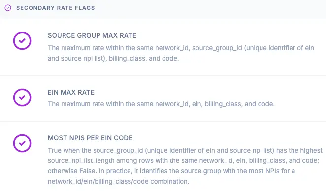
A rate can carry one flag, two, or all three. When all three align on a single row, the decision that used to take a filtering exercise now takes a quick glance.
Here’s an example of a rate analysis that doesn’t have vs. does have the secondary rate flags:
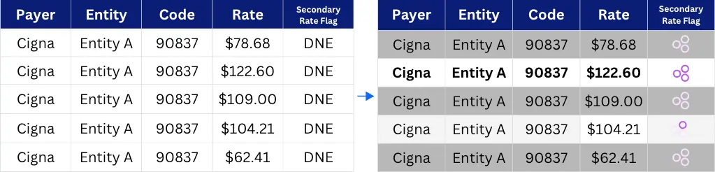
In this rate-level analysis, you can see that, prior to our secondary rate flags, there’s no visual distinction between the rate lines. This is an incredibly common scenario and how most vendors provide the data.
When using Serif data, not only do you immediately see the correct rate for your search, you understand why. With all three flags highlighted, you know that the $122.60 rate is distinguished as:
- The highest rate of a given group of clinicians
- The highest rate of a given contracting entity
- Has an NPI-count that you can trust
Notice how the $104.21 rate does have a flag; the top circle notes that $104.21 is also a Source Group Max Rate. While this isn’t the negotiated rate we might be looking for, we can easily spot that rate belongs to a sub-group of NPIs. In this case, we’re looking at the max rate for Nurse Practitioners for this code. The disagreement here is itself a finding as it points to variances in how different NPIs have settled on their rates.
Identifying the right rate is now clear-cut. What we didn’t expect was finding more information from rates that don’t have the flags.
When You're Not the Max, Signal Tells You How Far Off You Are
For any rate that isn't the Source Group Max or EIN Max, Signal reports the percent distance from that maximum. That number is more than a gap measurement, it’s actually a pattern detector.
The most common pattern we see are rates sitting at exactly 85% or 75% of the maximum. That is the signature of a licensure-based rate tier:
- 100% for MDs
- 85% for Nurse Practitioners
- 75% for Masters-level clinicians.
What initially looks like three conflicting rates is actually one contract communicating three connected levels of reimbursement that are all correct rates.
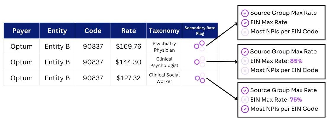
In this example, the data tells a more in-depth story about this payer's rate structure. The conventional approach treats multiple rates for the same code as a data quality problem to be resolved. The data suggests otherwise and that the clarity was always accessible, just buried in the comparison.
The percent-from-max enrichment turns that communication into something you can read directly off the row.
What This Changes
Rate selection used to be an undertaking. Now it's a simple attribute.
At scale, this narrows down thousands of rows from a multi-provider, multi-code analysis to only a few. Precomputing the answer at the row level here is what turns a market scale project into a query. Hours into seconds.
For teams benchmarking competitors, evaluating a market, or preparing a negotiation, the secondary rates flag feature means a speedier search with more confidence. With the variety of flags, you’ll easily surface exactly the cases that deserve a closer look.
The goal has always been to make rate selection obvious. Secondary rate flags are attached to every line-level rate across the platform, so the context you need to defend a number arrives with the number itself.
Want to see how secondary rate flags simplify your rate analysis? Contact the Serif Health team at hello@serifhealth.com to see them live in Signal.