
.webp)
We’re excited to launch a major step forward in making payer price transparency more usable: a live, public inventory of every payer network we process into Signal and our APIs. You can explore it now here: serifhealth.com/inventory/payers.
For the first time, you can see Serif Health’s real-time assessment of the quality of every payer network, updated monthly across the entire Serif Health payer library. This view is designed to serve both technical users digging into machine-readable files (MRFs) for specific networks and business stakeholders who need confidence that the data powering their analysis is reliable. We’ve posted our MRF quality stats for over 200 payers reflecting all of the data we’ve sourced through the end of August 2025.
Why We Built This
Working with payer MRFs can be difficult: files are massive, provider lists can be duplicative, and rates may be ambiguous. Historically, our quality checks lived within our ingestion ETL/QA process, and were invisible to customers.
We decided to change that. By exposing network-level quality scoring, we’re not only doubling down on transparency but also helping our customers, and the industry at large, make better decisions about which networks to prioritize in their own analyses.
What You’ll See
Starting today, we are publishing our network quality statistics over time on our website and are bringing those same quality indicators into our network selection screens in our Signal product.
As an example of what this looks like, here is our new website summary quality stats page for Aetna’s main national PPO network:
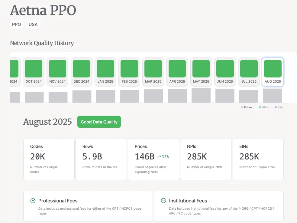
For each payer and network, you can now explore:
- Network Quality History: month-by-month scoring with easy hover details.
- Key Metrics: unique codes, rows, prices, NPIs, EINs
- Check Results: a transparent view of each test and pass/fail status.
- Comments & Observations: Our annotation notes where metrics don’t tell the whole story.
For example, in Aetna PPO you’ll see detailed commentary on their duplicative NPI reporting and ASC labeling.
.webp)
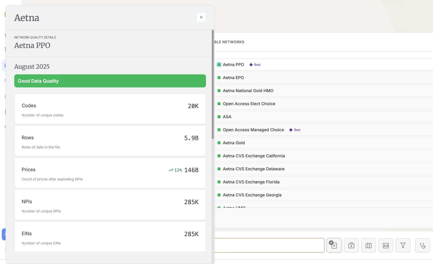
And these same summary statistics are exposed in the payer selection panel of our Signal experience:
How the Scoring Works
Serif has consistently monitored MRF data quality, which we are now making public. Every month, after data ingestion, each network is run through a set of fundamental completeness and accuracy checks. These objective, data-driven checks are focused on whether the data is fit for general downstream use rather than testing file format, structure, or schema compliance.
We currently run the following tests:
- Professional Fees – Are any CPT/HCPCS services priced with a professional billing class?
- Institutional Fees – Are any DRG/CPT/HCPCS/RC/APC services priced with an institutional billing class?
- Common Codes – Do we see rates for a defined set of heavily-utilized codes?
- Common Taxonomies – Are core provider types represented (Family Med, OB, Ortho, Acute Care Hospital, Behavioral Health, etc.)?
- Priced Providers – Are enough NPIs and EINs actually connected to in-network negotiated rates (not just listed in the reference block)?
- Ambiguous Rates – Does the posting avoid multiple conflicting rates for the same provider/service combination?
We’re in the process of developing and statistically validating two additional tests:
- CMS Baseline – Are rates generally at or above reasonable CMS reference levels?
- Percentage negotiation_type usage – Does this posting primarily contain records with a percentage negotiation_type?
Then, using a simple algorithm:
- ✅ Green = all tests pass.
- ⚠️ Yellow = one test fails.
- ❌ Red = two or more tests fail.
This scoring provides an actionable guide for consumers of the data, reflecting how much effort the data may effectively require in order to use it relative to other data files. Green means the dataset should be usable out of the box. Yellow means “proceed with caution”; a consumer of this data may need to gap fill from other sources, correct or crosswalk values in the dataset. Red means the dataset has significant limitations and likely gives limited value in an analysis. Note that some of the payer networks we source, including rental networks and behavioral health networks, may receive a low score by these metrics, but still be useful for specific use cases.
Why This Matters
Price transparency data is only valuable if it’s trustworthy, consistent, and actionable. By publishing quality scores openly, we’re committing to:
- Transparency in processing – every customer sees the same checks we use internally.
- Consistency over time – our monthly history quickly identifies posting issues and changes.
- Actionable guidance – scores are tied to real downstream usability, allowing users to assess usefulness of individual payers and provides visibility to payers with lower quality MRFs to improve their reporting
This is not a static report; it reflects our live processing and enrichment, updating as new payer postings go live and our monthly processing completes. Expect September 2025 data in the coming weeks!
Explore Now
The inventory is live today. Take a look, dive into the details, and let us know what you think: we’re building this with the same spirit as the underlying regulation: more visibility, more usability, more accountability.
If you’re interested in working with our enriched, real-time price transparency data, we’d love to hear from you! Please reach out to hello@serifhealth.com or book time here.